
Importance of Typography in Today’s Design World
Typography is more than just picking a font and a point size from some drop-down menus on your computer.
It’s an art and a skill whose history goes back centuries, to the wooden and metal type used with printing presses. And while we can learn from typography’s long legacy, most of us could also use a few practical tips on how to help our type look better in everyday projects like resumes, newsletters, or business cards.
Is that you? Then you’re in the right place. This article will walk you through 5 tips and tricks for improving the way you use fonts in your design projects. Let’s get started!
Match the Mood to the Message
Think one font looks more or less like the next? Or maybe you have a favorite font that you use every chance you get. In either case, you may not be getting the most out of your font choices.
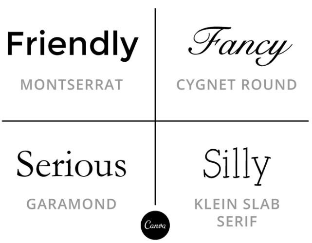
That’s because every typeface has its own mood or personality. Maybe it’s friendly, fancy, serious, or silly. But most fonts aren’t one-size-fits-all, so you’ll need to determine what a particular font is saying to you, and whether that fits with your design. A good way to do that is to brainstorm some of the qualities or characteristics that you want your design to communicate. If you have your content planned out ahead of time, even better—you’ll be able to match up your font choices with the tone already established in the text.
Type designer Eben Sorkin puts it this way: each typeface has its own voice. This voice influences how we feel about the text we’re reading, but also how we’re able to absorb and process information:
“It can also be a powerful force for making text communications of all kinds more effective and persuasive.…when the personality of the font you use matches the personality of the text, people are able to read that text more quickly and easily. When it doesn’t, it’s jarring and slows them up. The easier we make it for visitors to read, the more likely they are to find what they were looking for, click, buy and/or return [or follow through on whatever the purpose of the design happens to be].”
A few quick examples:
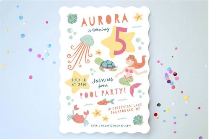
A vintage-yet-modern combination of fonts for a haircare product based on a recipe from “a bygone era.”

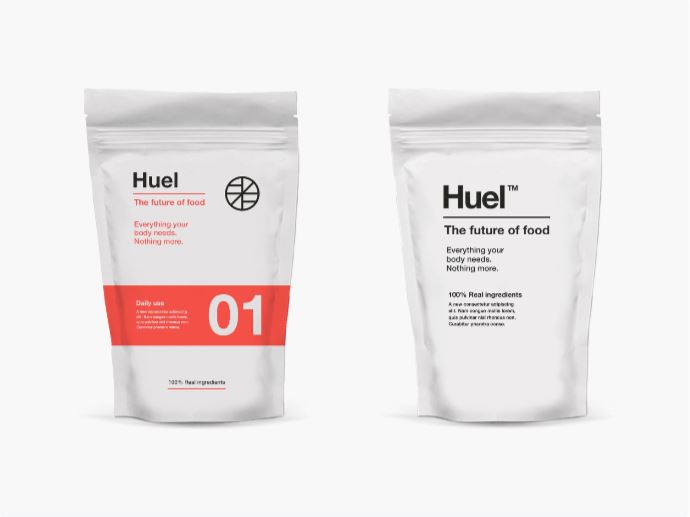
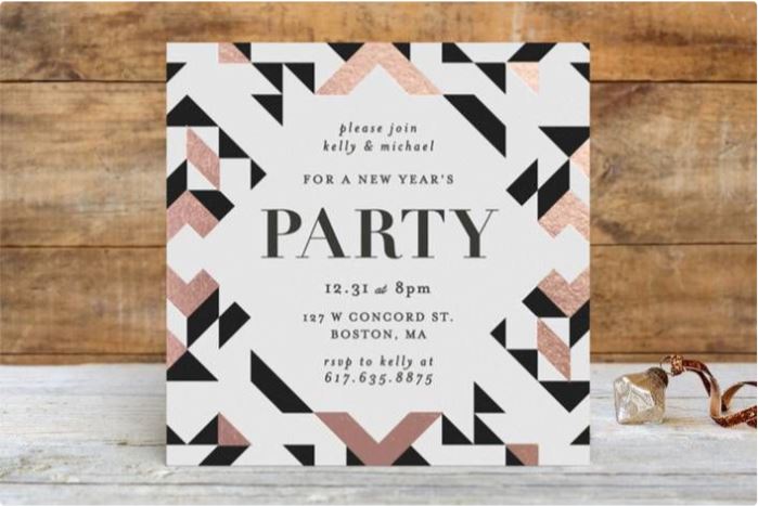
A minimal, Swiss-inspired design aesthetic and type treatment for a back-to-the-basics product.
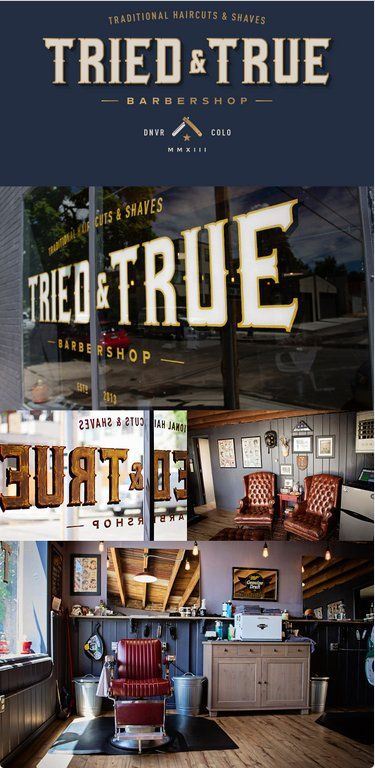
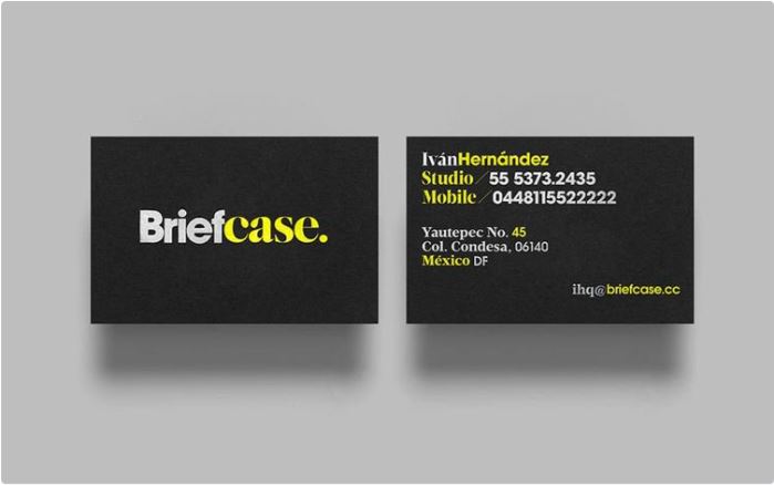
Type choices that communicate history and craftsmanship—a visual match for both the words being spelled out and the overall branding of the business.
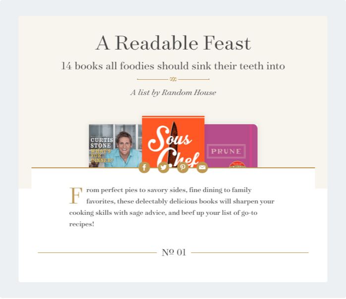
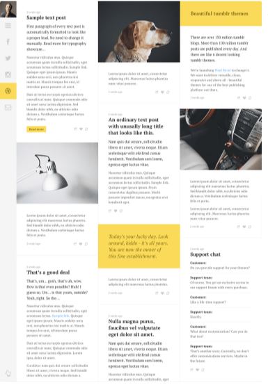
Classic-looking serif typefaces seem fitting for the blog of a traditional book publisher that’s been around since 1925, but the fonts’ readability, clarity, and approachable design qualities give them a modern edge and make them practical for web use.
Match the Mood to Your Audience
So you’ve picked out a font that you think perfectly complements the purpose of your design. Great! There’s only one problem… not everyone will interpret the mood of a font in the same way. After picking a font that suits your design, you’ll want to also make sure that it’s a match for your audience.
One group might see a font as trendy, while another sees the same typeface as dated. That’s because the way we perceive fonts is largely influenced by cultural associations, which are linked to both age and location. So being sensitive to perspective of the demographic you’re designing for—and getting a second opinion from someone who’s in that group if you’re in doubt about your font choice—will be important for making your typography as effective as possible.
But what if you’re working on a design that needs to communicate to a wide range of people, rather than a specific audience? You may want to opt for a more neutral typeface, one that doesn’t have an obvious personality, but instead blends into its surroundings. These types of fonts, sometimes referred to as “workhorse” typefaces, are usually basic serif or sans-serif fonts that can be used pretty much anywhere because they don’t draw a lot of attention to themselves.
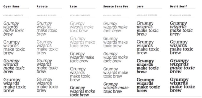
The most useful sort come in a variety of weights (such as light, regular, medium, bold, or heavy) and styles (such as narrow, condensed, extended, or small caps). We’ve recommended a handful of free, neutral typefaces over on The Design School’s fonts category page (where you’ll also find other great typography-related resources!).
Match the Font’s Point Size to the Design Context
When choosing and arranging fonts in a design, good readability should be one of your first concerns. You don’t want to frustrate your audience by making text too small to read easily—or annoyingly large, for that matter. As a general rule of thumb, body text should be between and 10 and 12 points for print projects, and 15 to 20 pixels on the web (most browsers’ default text size is 16 pixels). The ideal size may fluctuate a bit depending on the characteristics and structure of a particular typeface.
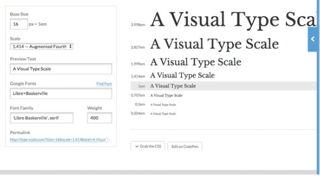
What about other types of text not intended for reading at length? You should try to use the context of the design—it’s physical size and/or how it will be presented or displayed—along with some common sense as a guide. Smaller projects (like business cards, for instance) or lengthy passages of text will call for smaller-sized fonts, but these fonts will also need to be clear and easy to read rather than decorative.
Larger projects like posters can handle sized-up fonts because there’s more space to work with and people will generally view these designs at a distance. With projects that have relatively little text, depending on the context and audience, you may have the potential to get a little more creative and stylized with your font choices.
Set Up a Hierarchy
When a design has good hierarchy, it’s well organized, easy to navigate, and simple to find the information you need. Typographic hierarchy is particularly important for text-heavy designs such as newsletters, magazines, books, and other traditional print publications, as well as some websites.
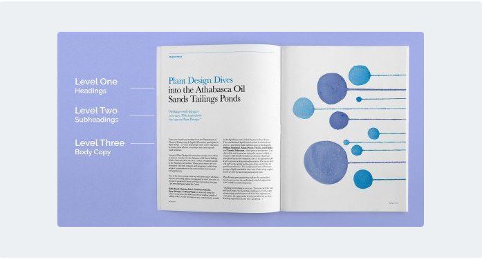
The basics of setting up a hierarchy in your design involve the following:
- Using text size to prioritize information by importance
- Using sufficient spacing to create an easy-to-scan structure
- Grouping related items together
- Including clear sections (with headings, subheadings, etc.) when applicable
 For an in-depth look a typographic hierarchy, make sure to check out Why Every Design Needs Three Levels of Typographic Hierarchy.
Don’t Neglect Spacing and Alignment
The details can make (or derail) a design. And some of the details that have the most impact in a design are spacing and alignment. They can make the difference between a confusing, cluttered design and a clean, orderly one.
Let’s review some of the most common types of spacing first:
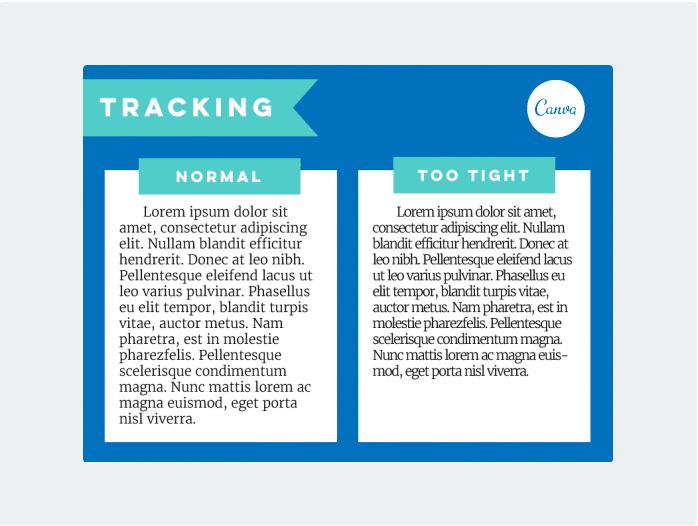
Tracking: Also called letter-spacing, this is the consistent amount of horizontal space between all the letters in a passage of text—perhaps a sentence or a paragraph. Adjusting this setting will make your text look tighter or looser overall. Decreasing the tracking is a common technique for saving space in a design, but that can make for difficult reading. Finding a happy medium (neither too tight nor too loose) that works with your font choice is the best way to preserve readability.
 Leading: Also called line-spacing, this is the vertical space between lines of text. Like with tracking, going too extreme in either direction can make for hard-to-read text and a design that just looks “off.”
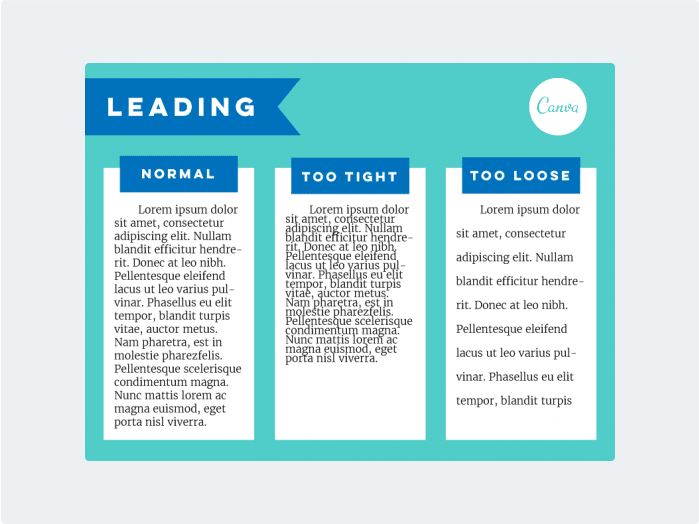 Margins: This is the blank space around the edges of your design. Unless you’re creating a specific, intentional effect, you don’t want your text looking like it’s going to fall off the page (or screen). A generous amount of blank space around the edges makes for more comfortable reading.
White Space: This is the term used to refer to any blank/white/empty spaces in your design. When you have a lot of information to fit in, white space can seem like wasted space, but it’s actually an essential part of a balanced, organized design. It keeps viewers moving visually through a design and gives their eyes a place to rest.
 As to alignment, consistency is the best way to improve your typography. Mixing text alignment styles (left, right, center, justified, etc.) in a design without any purpose or logic just looks sloppy.
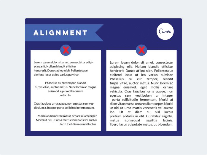 A couple quick tips:
- Avoid justified alignment. It almost always creates irregular spacing and random chunks of white space that look sloppy and make reading difficult.
- Pick one style for your body copy (typically left-aligned) and stick to it.
Sourabh Tomar
- Faculty: IVS School of Design
Wow, amazing weblog structure! How long have you ever been running a blog for? you make running a blog look easy. The whole glance of your web site is fantastic, let alone the content!
wonderful put up, very informative. I wonder why the opposite experts of this sector don’t realize this. You must continue your writing. I’m confident, you have a great readers’ base already!
Thanks for the interesting things you have discovered in your blog post. One thing I’d prefer to comment on is that FSBO connections are built after a while. By bringing out yourself to the owners the first saturday and sunday their FSBO is definitely announced, ahead of the masses start calling on Thursday, you develop a good relationship. By giving them resources, educational materials, free accounts, and forms, you become a good ally. By taking a personal fascination with them along with their problem, you create a solid relationship that, many times, pays off in the event the owners opt with a real estate agent they know plus trust – preferably you.
I抳e been exploring for a little for any high quality articles or blog posts on this sort of area . Exploring in Yahoo I at last stumbled upon this web site. Reading this information So i am happy to convey that I’ve a very good uncanny feeling I discovered just what I needed. I most certainly will make certain to do not forget this website and give it a glance on a constant basis.
Thanks for sharing these kinds of wonderful threads. In addition, the right travel along with medical insurance strategy can often eradicate those fears that come with touring abroad. Any medical emergency can in the near future become expensive and that’s likely to quickly put a financial problem on the family finances. Setting up in place the ideal travel insurance package deal prior to leaving is well worth the time and effort. Thanks
Post writing is also a fun, if you be acquainted with after that you can write if not it is complex to write.
Howdy! I’m at work surfing around your blog from my
new iphone 4! Just wanted to say I love reading your blog
and look forward to all your posts! Keep up the fantastic work!
Thanks for sharing your ideas here. The other factor is that every time a problem arises with a laptop or computer motherboard, people today should not go ahead and take risk connected with repairing this themselves because if it is not done properly it can lead to permanent damage to the full laptop. It is usually safe just to approach your dealer of a laptop for the repair of its motherboard. They have technicians who may have an know-how in dealing with laptop motherboard challenges and can make the right diagnosis and execute repairs.
Your style is very unique in comparison to other folks I have read stuff
from. Thanks for posting when you have the opportunity, Guess I’ll just bookmark this web site.
I beloved as much as you will receive performed proper here. The cartoon is tasteful, your authored subject matter stylish. however, you command get got an shakiness over that you wish be handing over the following. ill surely come more until now once more as exactly the similar nearly very steadily within case you shield this increase.
Almost all of the things you point out happens to be astonishingly appropriate and that makes me wonder the reason why I hadn’t looked at this in this light before. Your piece really did switch the light on for me personally as far as this specific topic goes. Nonetheless there is actually one particular factor I am not too comfortable with and while I attempt to reconcile that with the core idea of the point, permit me observe what all the rest of the readers have to point out.Nicely done.
I enjoy, lead to I found exactly what I was taking a look for. You’ve ended my 4 day long hunt! God Bless you man. Have a great day. Bye
I’ve been surfing online greater than 3 hours these days, yet I never found any attention-grabbing article like yours. It is lovely worth sufficient for me. Personally, if all website owners and bloggers made just right content as you did, the web will be much more useful than ever before.